
Unequal Responsibility for Carbon Emissions
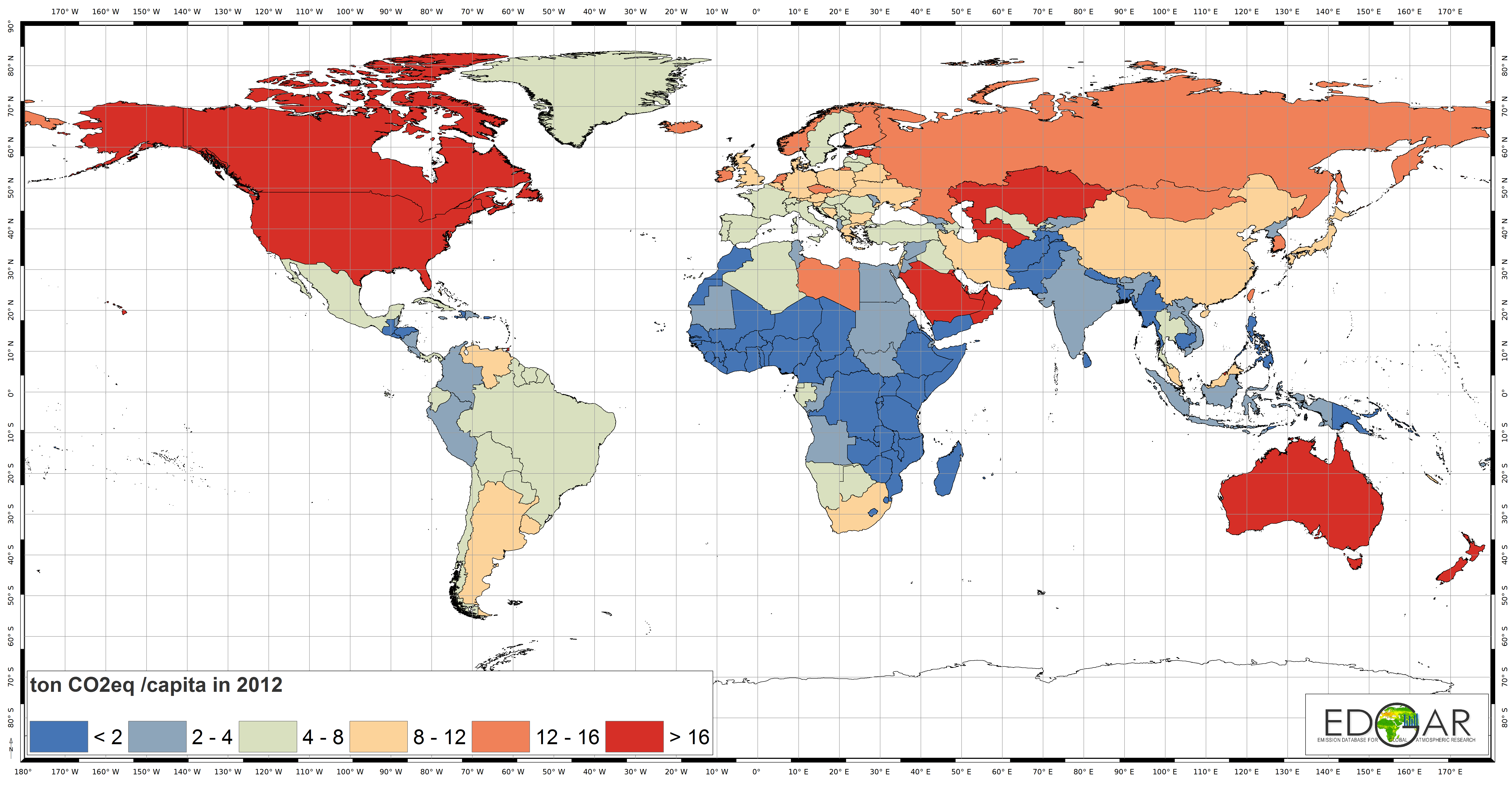
The map depicts the per capita emissions of carbon from the burning of fossil fuels by country. Countries in red emit the most carbon dioxide per capita. The United State’s per capita carbon emissions in 2014 were 16.6 tons. Countries in pale blue have a per capita carbon emissions that are world average of 4 tons.
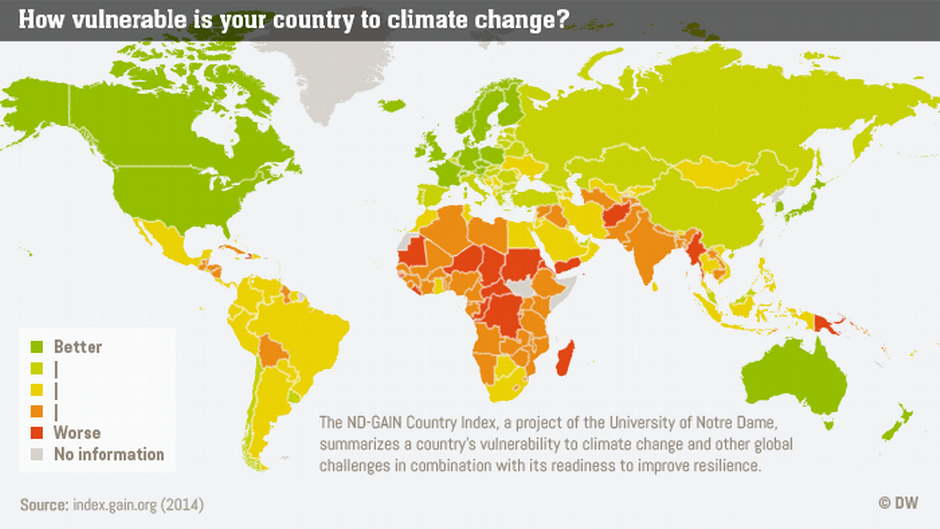
The above map shows vulnerability to climate change. Comparing this map to the one above, we can see that those countries the least responsible for climate change have the greatest vulnerability to climate change.
Two drivers lead to this result. One, the higher risk countries lie within the global tropical regions and will experience high temperatures and extreme drought and floods. Secondly, the most vulnerable countries also are the poorest countries, which translates into the least resilience to climate change. The wealthier countries are the most resilient as the wealthy have the resources to bounce back from a catastrophe.
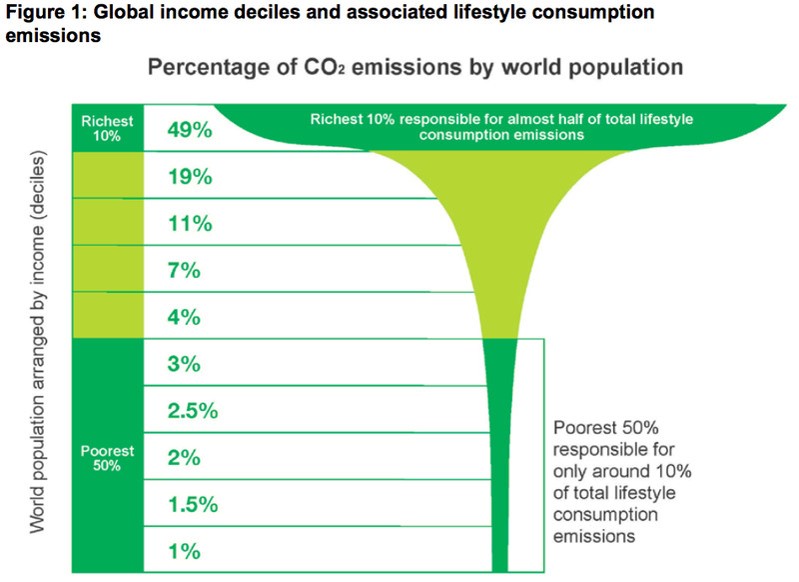
This chart shows that the top ten wealthiest of the world’s population emit half the carbon emissions. The median American wealth (middle 20%) is $68,828.
The Earth’s poorest 50% already suffer and will suffer much more because of how the wealthiest 10% of people consume products and services that burn fossil fuels. These people have the least responsibility for climate change.

Up to 5 billion face ‘entirely new climate’ by 2050, an article from Climate Central, presents research on climate vulnerability.