
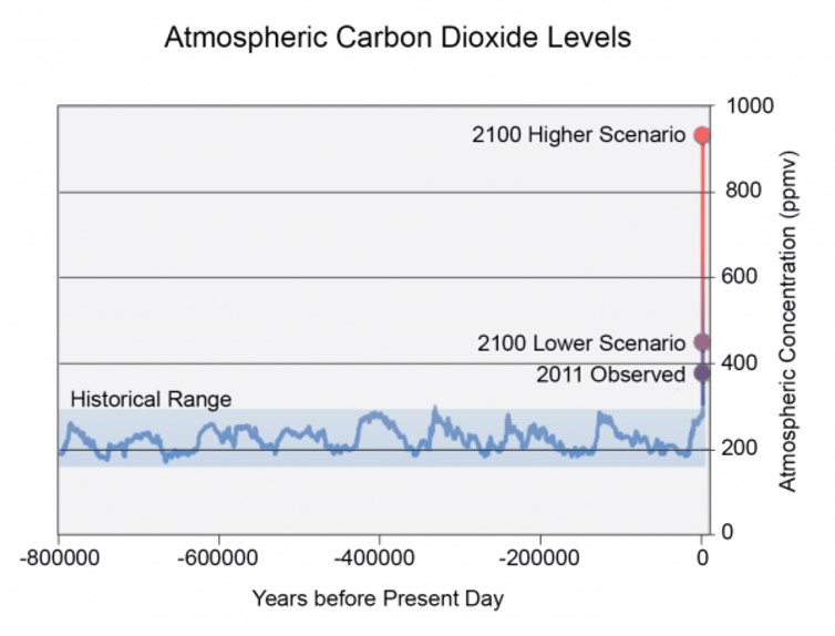
In the graph above you can see that for the past million years, the carbon dioxide concentration in the atmosphere has bounced between 200 and 300 ppm.
In 2016, we reached 400 ppm, meaning that it was at this level year-round.
The lower emission scenario, the target of the Paris Climate Agreement, requires us not to exceed 490 ppm in 2100 so that we can stay below 1.5 C degrees warming.
The higher emission scenario, which is what we’ll get if we keep on burning fossil fuels, is above 900 ppm.
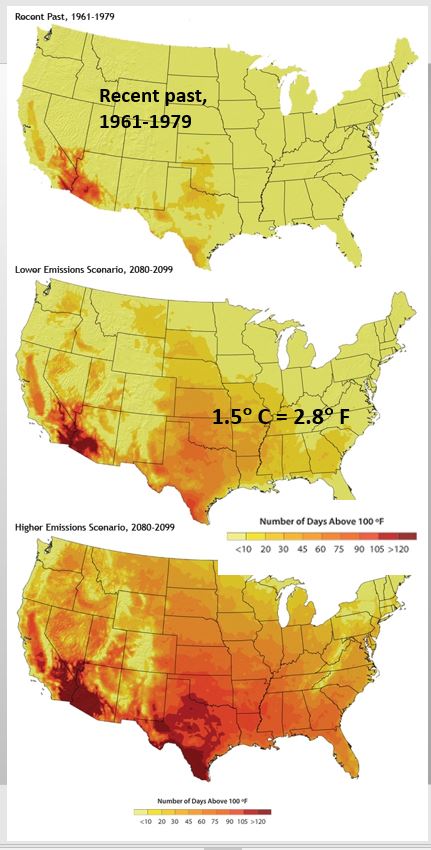
The maps above help show the differences between the lower and higher emission scenarios.
Looking at the color key at the bottom, the darker the red the more days in a year above 100 degrees F.
Looking at the top map, this is the historic average number of days annually above 100 degrees F. You can see the southwestern deserts have many days above 100 degrees but the rest of the country historically has had 10 or fewer days above 100 F.
The second map depicts the low emission scenario projections (1.5 C warming) for 2100. You can see that much warming occurs across most of the country. Climate change cannot be stopped.
Note: even at this level, the warmest areas are in our “bread basket”, which will also experience drought, threatening our food security.
The third map show the higher emission scenario projections for 2100. You can see that most of the United States is experiencing two to four months annually above 100 degrees F. Some areas of the country may at this point be unlivable.
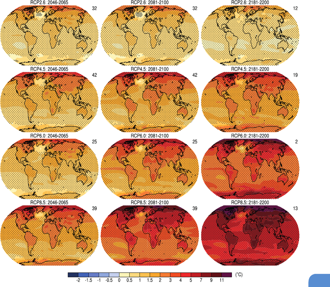
The above picture shows the same information in a different format.
Each row represents a climate projection scenario. The top row is the lower emission scenario, the basis of the Paris Climate Agreement. The bottom row is the higher emission scenario.
The first column is 2050, the second – 2100, and the third – 2200.
The color differences are based on the differences in average temperature between the historic and projected average. The darkest color is 11 degrees centigrade difference, approximately 20 degrees Fahrenheit.
Look at the top row – the lower emission scenario, you can see that it is projected that by 2200 the planet has begun to cool.
Look now at the bottom row – the higher emission scenario, it is projected that the planet is still warming by 2200 and that it has already reached such high temperatures that civilization and probably life forms as we know them have utterly changed.
You can understand why the lower emission scenario of the Paris Climate Agreement is the one we need to achieve.
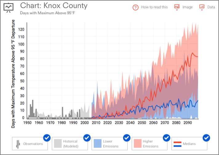
The above graph shows the temperature effects of the lower and higher emission scenarios on Knoxville. The graph was produced by the Climate Change Institute of NOAA – National Oceanic and Atmospheric Administration
The graph shows the projected number of days above 95 degrees F in Knoxville
The top red line is the higher emission scenario, and by 2100 Knoxville will experience 80 more days above 95 degrees, approximately three months above 95
The bottom blue line is the lower emission scenario, and by 2100 Knoxville will experience 20 more days above 95 degrees, less than one month of additional days.
Also, look at the top red line and see that the frequency of days above 95 degrees is still rising. Notice the bottom blue line, the lower emission scenario, that the frequency of days above 95 degrees has stabilized.
MORE CLIMATE PROJECTION RESOURCES
The Climate Impact Lab has climate projection maps for different level of carbon emissions. With this map, you can see the benefits of staying under the 1.5 degrees centigrade warming level as by the end of the century the effects of climate change begin to fade. Many believe we have locked ourselves into the moderate emissions level, which means by the end of the century the planet will still be warming. If we fail to make any effort globally, then the result will be the high emission scenario.
Climate Central, an independent organization of leading scientists and journalists, researches, reports the facts about our changing climate and its impact on the public. This site has some incredible graphics on how different levels of climate change will affect our region and world.
- Look at this one on surging sea rise.
- 167 Tiny Maps Tell the Major Story of Climate Change
- 1001 Blistering Hot Cities
Curious about the difference on life as we know it between 1 degree, 2 degree and 3 degree warming? Check out What Would 3 degrees Mean, by David Spratt on Climate Code Red.